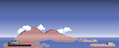
Right - last time in this sporadic series I had just finished making the 4 week MiniSquadron demo with the red scissors versus the yellow scissors, with you as the commanding Magenta Scissor (snigger - b3ta reference). And it was at this time that I went to show Dave Ferner and who then thought he could do some pretty art to make this game look "a bit better" (how could it possibly be better than what it is already?). One of the other things I decided to do about now is to basically give the game more of a proper structure and deciding on the final scope of it. As it stands, I was of the opinion that this was a fun enough concept to make into a "half fat" game that deserved at least 3 months of my time. I like to call it going "half fat", with "full fat" basically spending a year to make. This decision only came about when I saw the potential that this game could be from looking at the art that I received. Here is one of the first drafts of Level 1, which would eventually become "Duck Island" (click through for larger):
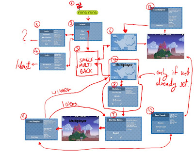
Inspired by this, I made a few trips to North London to sit with Dave and to work out a rough "Skeleton" for the game - what we in the games industry (snarf) call a "Vertical Slice". This little plan sketched out the need for some kinda map, with a number of levels to unlock, and in particular - my idea my idea! - to include *lots* of planes. I really wanted the Pokemon "collect-them-all" feeling going on here - this was crucial. Anyway - we came up with a strong plan for a "half fat" version of the game and proceeded to create the Vertical Slice with placeholder art and me doing the basic coding so we get the structure of the game in place. It is VITAL to do this part because at the moment all I had was some kind of mad tech demo with scissors tailing each other. As an example of the level of "planning" that I did here is the flow-chart for the menu system (note again, the SCISSORS) (click through for bigger):
And also - check these never before seen placeholder pre-visualisation of some levels made by Dave:
They're super simple but that's all that's required right now. So while all this was going on I coded the Vertical Slice (mmm tasty). Many decisions were made in this period - and this is a source of a lot of fun as well as a lot of amusing jokes. MiniSquadron started off as AccelerometerGame, and it was time to change it to something more relevant. The "official" codename then became "AirRage" - players of MiniSquadron will probably understand the "AirRage!" sign that pops up in the game! In fact, playing dirty and trying to maximise our chances of being noticed in the App Store we were just thinking up names that begun with the letter A. I think at one point Dave suggested "AaaaaaaairRage".
OK, one of the things I really want to talk about is the controls of the game. When I started making the game I had this blinkered philosophy that "any iPhone game with an on-screen UI is a game that is obviously not well designed for the device". So that's why the original control for MiniSquadron was the Accelerometer and with no UI. This was RUBBISH. NO ONE could control the thing and I distinctly remember someone playing it for 2 minutes before going back to Flight Control (sigh). So, coming to my senses I reverted to what I know best which was "normal" d-pad controls - but with NO VISIBLE UI. Still sticking to my blinkered philosopy, I made the left side of the screen a virtual d-pad and the right side of the screen a shoot button (so you tap anywhere to shoot).
Now here's the interesting thing - the controls were actually usable, and would be refined to the final thing that you can see in MiniSquadron. But the most important part is the NON VISIBLE UI part. When I tried this system on people - after explaining to them about the fact that the left side of the screen is a d-pad and the right side is shoot - people started using it fine but they would always put their finger in the MIDDLE of the screen for control. What was the result of this? It completely blocked the view of the game! What's more interesting is that *I* would do that too even though I know I should be pressing the corners of the screen to "maximise visible screen area". Basically:
Without a VISIBLE d-pad and button to TELL YOU WHERE TO PUT YOUR FINGER the brain places your finger automatically in the middle of the screen!
I mean - even I did it and it was definitely an unconscious thing! This was a New Thing that I learnt whilst making the game. So in the end, in as much as the UI was visible so that no explanation was required to explain the controls, it was also used to tell you where to put your finger in order to maximise visible screen area.
OK, getting bored now, so I will end with a fairly amusing look at an early PreViz of the in game action. Things to note are the excellent animation stuff (I started frothing about how we should be more like Metal Slug!), and the beginnings of the "zoom in" effect when you get a kill.
Edit: Did I mention how difficult coding and implementing the controls were? Well they were one of the most frustrating parts of the project. Tearing my hair out at why people can't turn the plane and bombing into the ground. The controls were refined for the entire duration of the 4 month project.
Also: If you notice in those early shots you can see in every level there was always 2 runways. This was because in the early builds all the planes start off by being on the runway and taking off. This was fun to watch but actually added almost nothing to gameplay so was taken out.
Tune in next time for - Icon Fun, Illustrations, Network Tools and the Magic Plane Making Machine


I'm really enjoying these posts and the game :)
ReplyDeleteAwesome stuff! Keep it up, really interesting read.
ReplyDeleteHow are the sales going? I saw you made it on the featured list!
ReplyDeleteGreat read. I bet the controls refining was the hardest part! I like the slight acceleration from dive-bombing the plane & also the hair-razing loops that literally daisy-cut the ground!
ReplyDeleteHalf-fat indeed! Like the ideas of some of the updates pending. Multiplay (+4 human planes!) would be revolutionary if pos? Also some "navigate terrain/obstacles" features might be a diversion too.
The numerous cute manga-esque planes & ghibli-style backgrounds are a real winner with the controls. Top draw!
Hey Tak, I love this game. I purchased it a few days ago and cannot put it down. The office has been having mini tournaments and everyone is trying to collect all the planes. I even put it on my development phone and changed a few of the settings and sprites to create a whole new plane called the Destruct-O-Blimp. I had people rolling when they saw it fired missles at .05ms. You did a great job with this game and I really like this series on your blog. You are a real inspiration.
ReplyDeleteHey Joe! Thanks for the comments! So did you change some of the sprite pages? I would *love* to see what you've done!! Email me on mini.squadron.game at gmail dot com!
ReplyDeleteFinally got a chance to look at the video. It looks cool with all those full screen blurring and shaking.
ReplyDelete